SooGood: Smoothies & Coffee
Identity Development
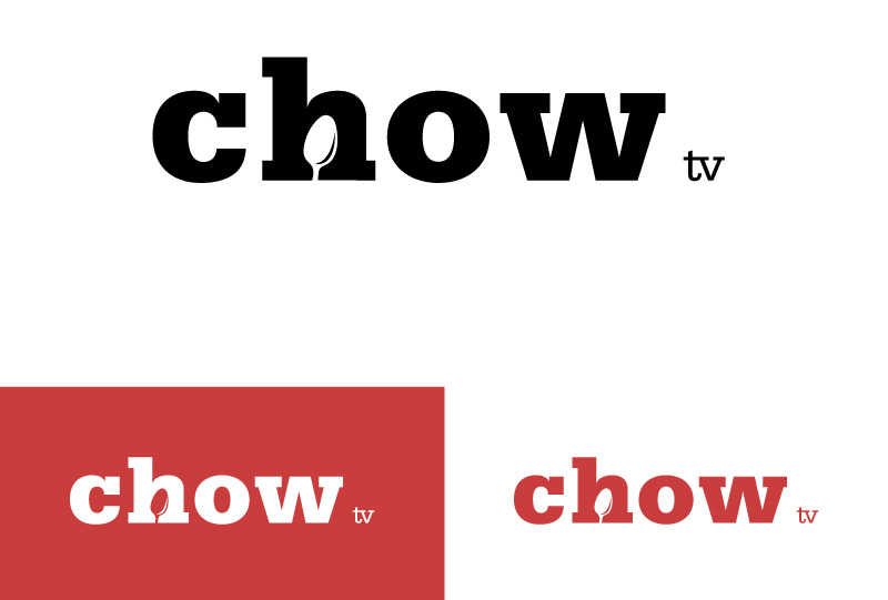
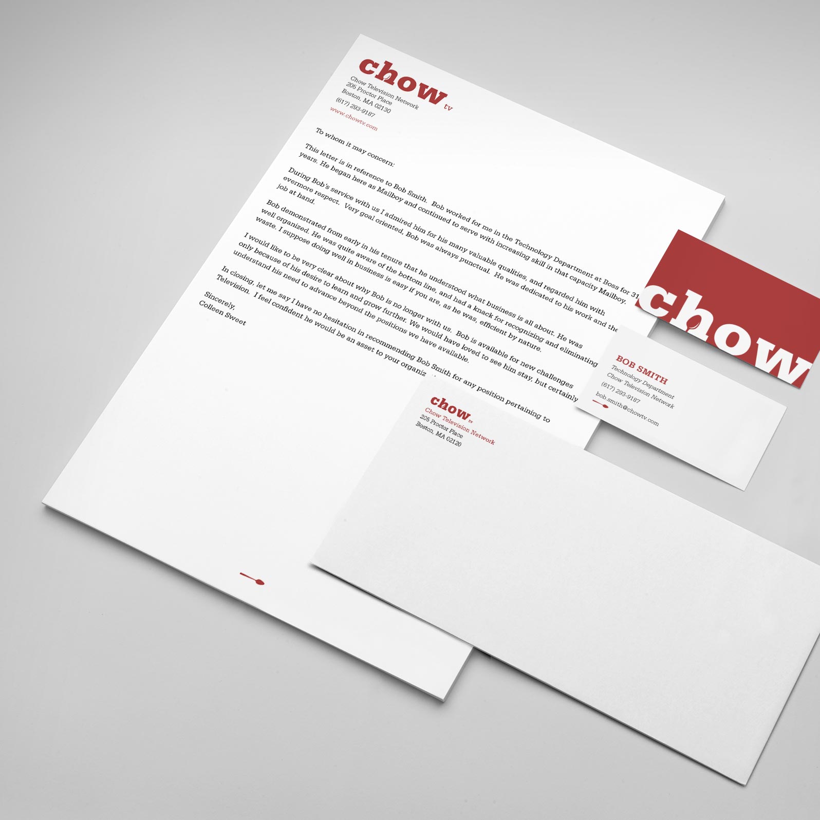
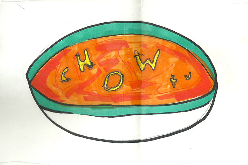
Chow TV is a television network, for this assignment I had the freedom to come up with my own programming as well as set the tone of Chow TV. The television network is centered around local cuisine, with a focus on getting back to the roots of learning how to cook. While building the brand out, I was faced with the challenge of creating a logo that functioned both in print, and on screen. I wanted to create a brand that induced a tactile feeling while remaining simple and down to earth.
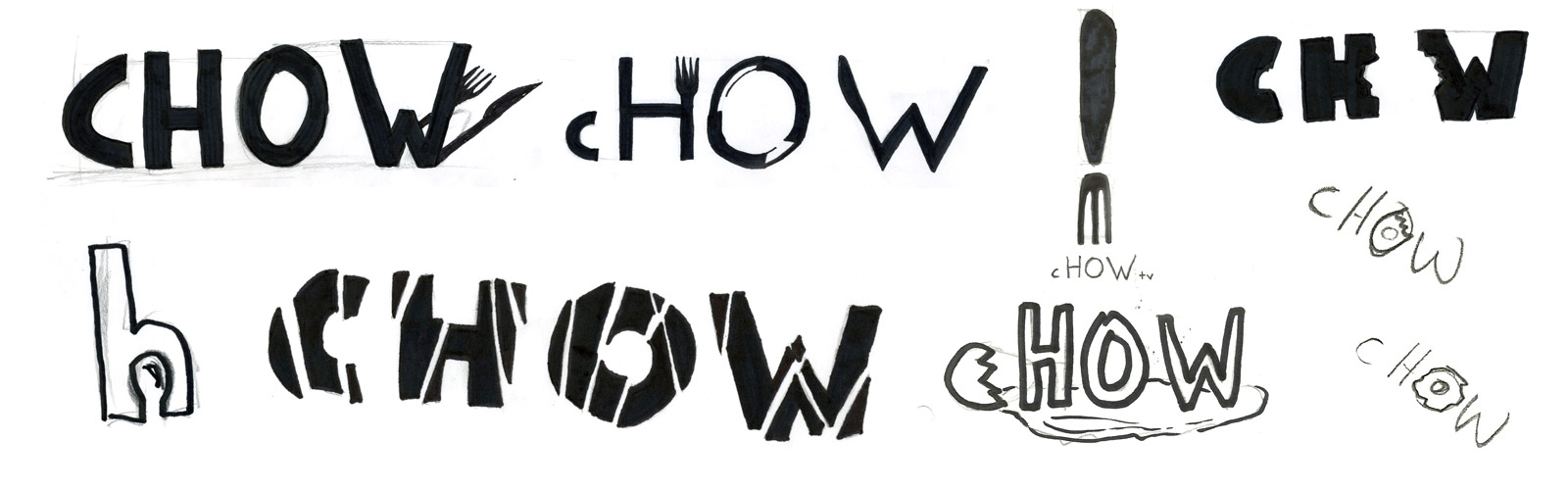
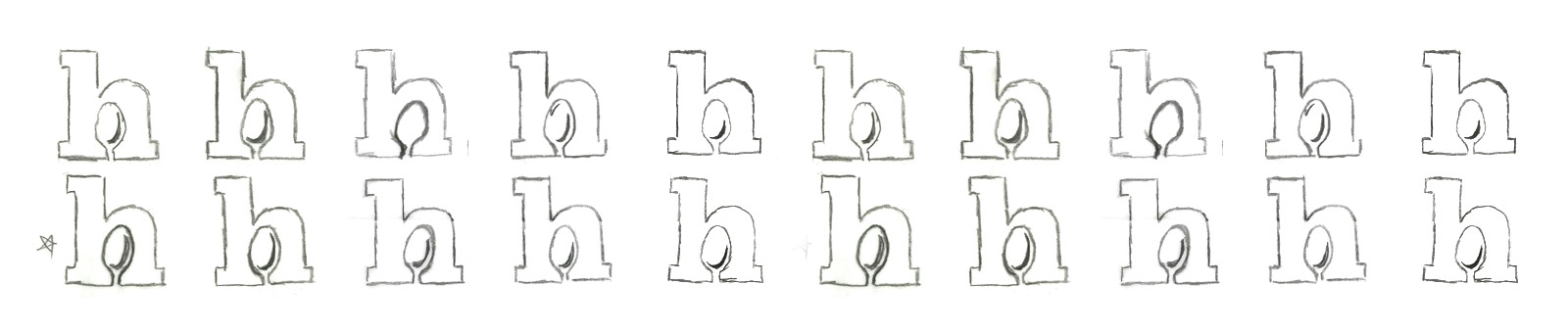
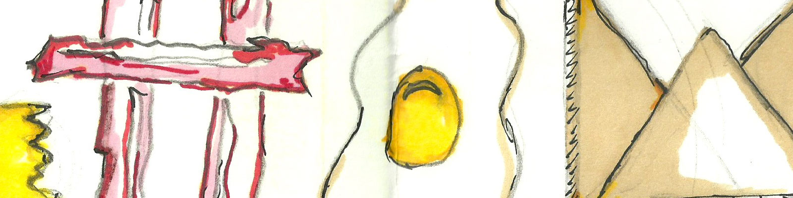
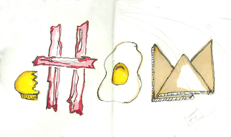
As my sketches developed I began to focus on the utensils that a person uses while cooking, trying to create a mark that would instantly make a viewer think of food. I ended up with a subtle logo that created a spoon out of the negative space within the 'h' of chow. I worked to develop the perfect relationship between the 'h' and the spoon trying to leverage the epiphany moment a viewer gets when they discover the spoon, to mimic the feeling a person gets when they've finally mastered a skill i.e cooking.
Once the foundation of the brand was built, I began to develop the dynamic components of Chow TV. I drew a lot of my inspiration from 90s MTV commercials, trying to create an extremely visceral experience. I merged sound and imagery to create the feeling of getting up in the morning for Chow TV’s morning schedule. From there I began using the spoon element of the logo as a vehicle for how the brand act on screen.
Identity Development
Identity Development, Website Design
Website Design
Website Design
Data Visualization
Identity Development
Poster Design
Print Design
Data Visualization, Animation
Print Design